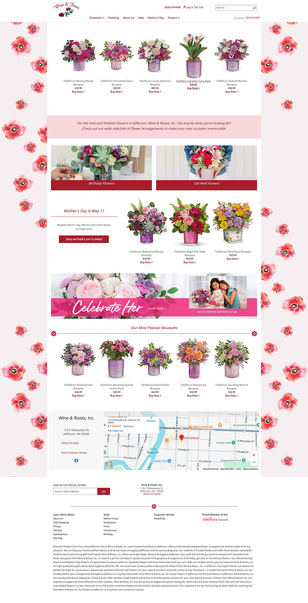
Wine & Roses has gorgeous flowers, but their online vibe didn't really match that. The logo felt a bit old-school, and the website wasn't doing a great job of showing off their personality or the quality of their work. Time for a refresh to bring their online look up to par with their awesome flowers.

The Challenge
Wine & Roses Branding and Landing Page Remake
Redesigned the landing page and Logo for a local Jefferson, WI florist to modernize their online presence. Improve user experience and better showcase their beautiful floral arrangements. Ultimately aiming to drive online orders and enhance brand perception.
My Client: Wine and Rose's Co.
My Role: Logo Design, UI/UX Design, Visual Design, Branding
Tools Used: Figma, Illustrator, Indesign
My Solution
Wine & Roses has gorgeous flowers, but their online vibe didn't really match that. The logo felt a bit old-school, and the website wasn't doing a great job of showing off their personality or the quality of their work. Time for a refresh to bring their online look up to par with their awesome flowers.
-
Symbol: I opted for a stylized, abstract representation of a blooming rose. The flowing lines evoke a sense of natural growth and elegance, moving away from potentially generic floral clip art.
-
Typography: For 'Wine & Roses,' I chose a modern serif typeface with gentle curves to balance sophistication with approachability. The slightly heavier weight of 'Roses' subtly emphasizes the core product.
-
Color Palette: The primary palette consists of a soft, creamy off-white to convey elegance and freshness, paired with a muted rose tone to directly reference the 'roses' and add a touch of romance. A deep plum acts as an accent for sophistication and visual interest.
-
Overall: The final logo aims for a balance of modern elegance and natural beauty. It's designed to be memorable, versatile across different platforms, and immediately recognizable as a high-quality local florist.
My Thought Process for Landing Page
Just like the logo, the existing online presence of Wine & Roses didn't quite capture the beauty and quality of their flowers. The website's vibe felt dated and didn't effectively showcase their personality. My goal for the landing page was to align with the refreshed brand identity, creating a modern and effective online experience. The primary objectives were to elevate their online presence, provide a seamless user experience for local Jefferson customers, and beautifully highlight their diverse floral arrangements to drive inquiries and potential online orders.
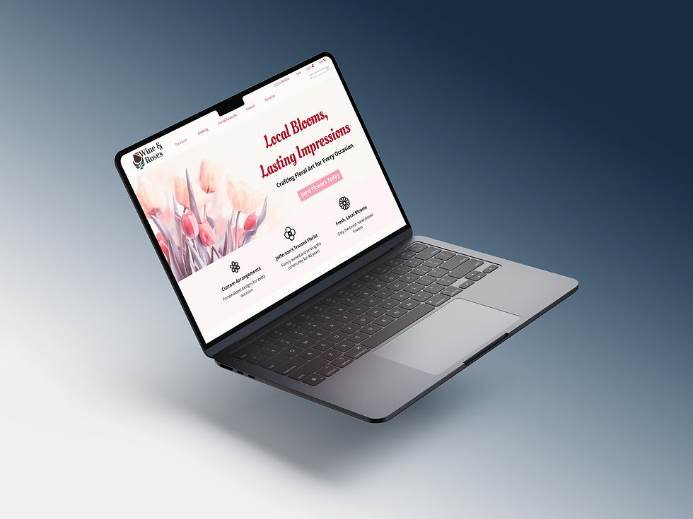
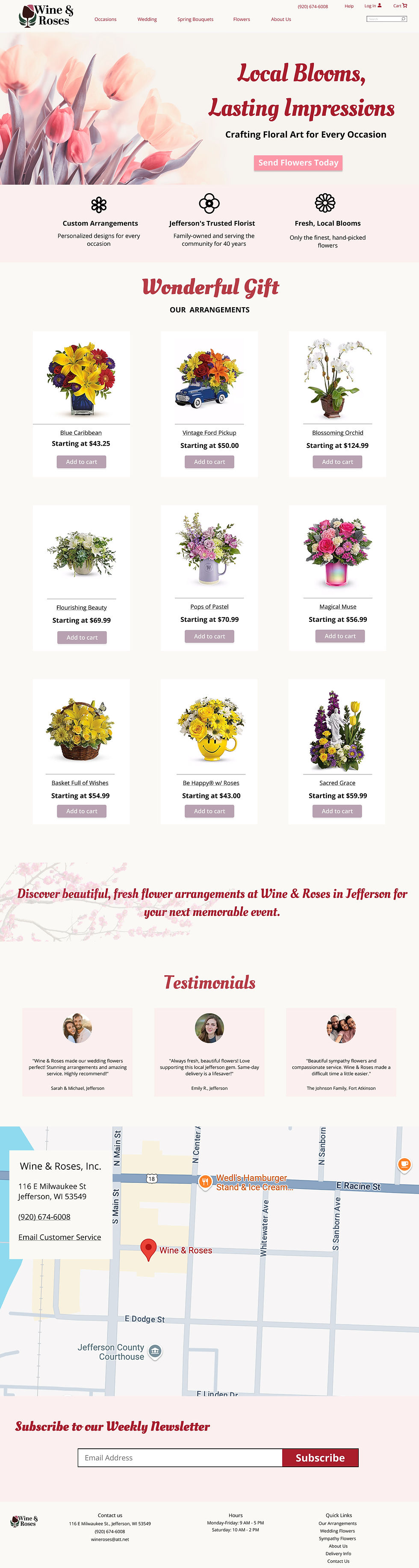
Hero Section:
-
For the hero, I really wanted to grab attention right away and showcase the beauty of Wine & Rose's flowers. That's why I went with a more vibrant, full-width image of a diverse bouquet. I think it immediately tells you what they're all about. The headline, "Local Blooms, Lasting Impressions", reinforces that local, quality feel, and pairing it with the tagline, "Crafting Floral Art for Every Occasion." To get people exploring, I placed a prominent "Send Flowers Today" button.
Benefits Section:
-
Right below the hero, I added a Benefits section to quickly hit the key reasons why someone should choose Wine & Roses. I picked 3 main points, like, Custom Arrangements, Jefferson's Trusted Florist, and Fresh, Local Blooms. To make these easy to digest, I paired each with a clean icon and a short, description.
Our Arrangements Gallery:
-
The heart of the page, for me, is the "Our Arrangements" gallery. I chose a clean grid layout to really let the flowers shine. Using high-quality images was a must to show off all the detail and artistry in each arrangement. The goal here was to make it super appealing and easy for people to find something they love.
Testimonials Section:
-
To build trust, I knew I had to include some love from past customers. So, I integrated a "Testimonials" section right after a, short tagline. I wanted the testimonials to feel real and approachable.
Location Section:
-
To further help locals, I embedded a Google Maps widget directly on the page. This allows potential customers to instantly see where Wine & Roses is located in Jefferson and even get directions with a single click.
News Letter Section:
-
To help Wine & Roses build lasting relationships with their customers and keep them informed about new arrivals, seasonal specials, and upcoming events, I included a dedicated newsletter signup section.
Footer:
-
For the footer, I focused on making sure all the essential info was easy to find. That includes their contact details – address, phone number, email – plus their opening hours and quick links to important pages like "Our Arrangements," "Weddings," and "Contact Us." Basically, it's all the practical stuff you need, nice and clear.
My Client: Kwik Trip
See the Change